The original intention was for this post to be long and detailed. The more I wrote, the more it felt like design pedantry. Prescriptive, pretentious, and wrong. Fuck that. So here’s the unfinished article.
Have a great time exploring and learning about how to use colour. Experiment every single day. If something doesn’t look right, it probably isn’t. I can’t tell you you’re wrong.
There are a number of principles anyone can follow to help them understand colour. It could be a designer, a developer, a doctor, or an accountant bored reading this on a Friday afternoon, and these basics will help provide a clearer picture of how humans perceive colour.
It is important to consider how colours influence other colours, how heavy colours feel on a page, whether colours are optically balanced, if the roles of colours are confused, and more.
This post will provide some lessons and ideas on how to consider the use of colour in any workflow.
Colours Have Weight
The amount of colour used on a page is important, but so is the weight of the colour itself. A heavily-saturated blue carries far more weight than a soft, desaturated blue of a similar hue.
Colour is not immune to the ‘less is more’ value many people hold close to their hearts. Each time a colour is used, it has a certain impact on an interface, so designers must be careful to strike the right balance in a design.

The left colour feels much lighter than the right colour
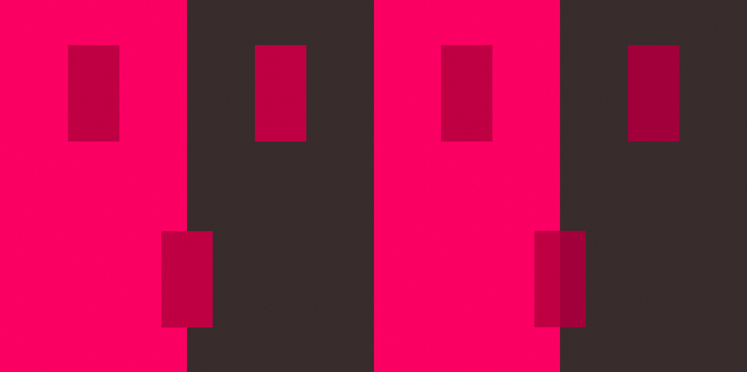
Colours Are Influenced By Their Surroundings
Every colour either influences or is influenced by its surroundings. A brand may have a particular pantone reference for its logo, but that does not mean that the logo will always look the same. The logo could feel lighter or darker depending on its the surrounding colours or the layout.

The rectangle on the left appears darker than the right, despite them being the exact same colour
The two small rectangles above are the same colour, but one appears darker than the other because of the way the colours are influencing one another.
Colour swatches and brand manuals are static whilst brains are not; these manuals do not consider how the human brain perceives colour, so some adjustment to colours is often necessary.
Making Colours Match
Using a colour as a reference (in this case the rectangle on the left) it is possible to adjust the brightness and saturation of the rectangle on the right until they appear the same.
In this case, the colour being changed appears lighter and less saturated than the reference colour, so the ‘brightness’ and ‘saturation’ values are being decreased in the HSB colour picker.
To make the right rectangle match the left rectangle, the brightness and saturation had to be decreased, as seen when the colours are set side-by-side on the illustration
Continue reading…
I told y’all this was going to be a short post, so you’re going to have to continue reading yourselves. A great place to start is with a book called Interaction of Colour by Josef Albers.
Interaction of Colour describes and demonstrates the complex relationships colours have to one another, along with principles of colour theory. Buy this. Enjoy it. Go forth and learn about color.